My first creation in Womp :) I’m not very experienced with 3D modeling, but Womp is simple, intuitive, and fun to mess around in. This little guy is loosely based off of my Pochacco ring holder. I’m hoping this’ll be my gateway drug into Blender LOL
I laid this flat on a desk to photograph, so the lighting is a little scuffed. I was initially worried that my linework and coloring style clash, but then realized the lines are fine enough that they make for a pretty good fit.
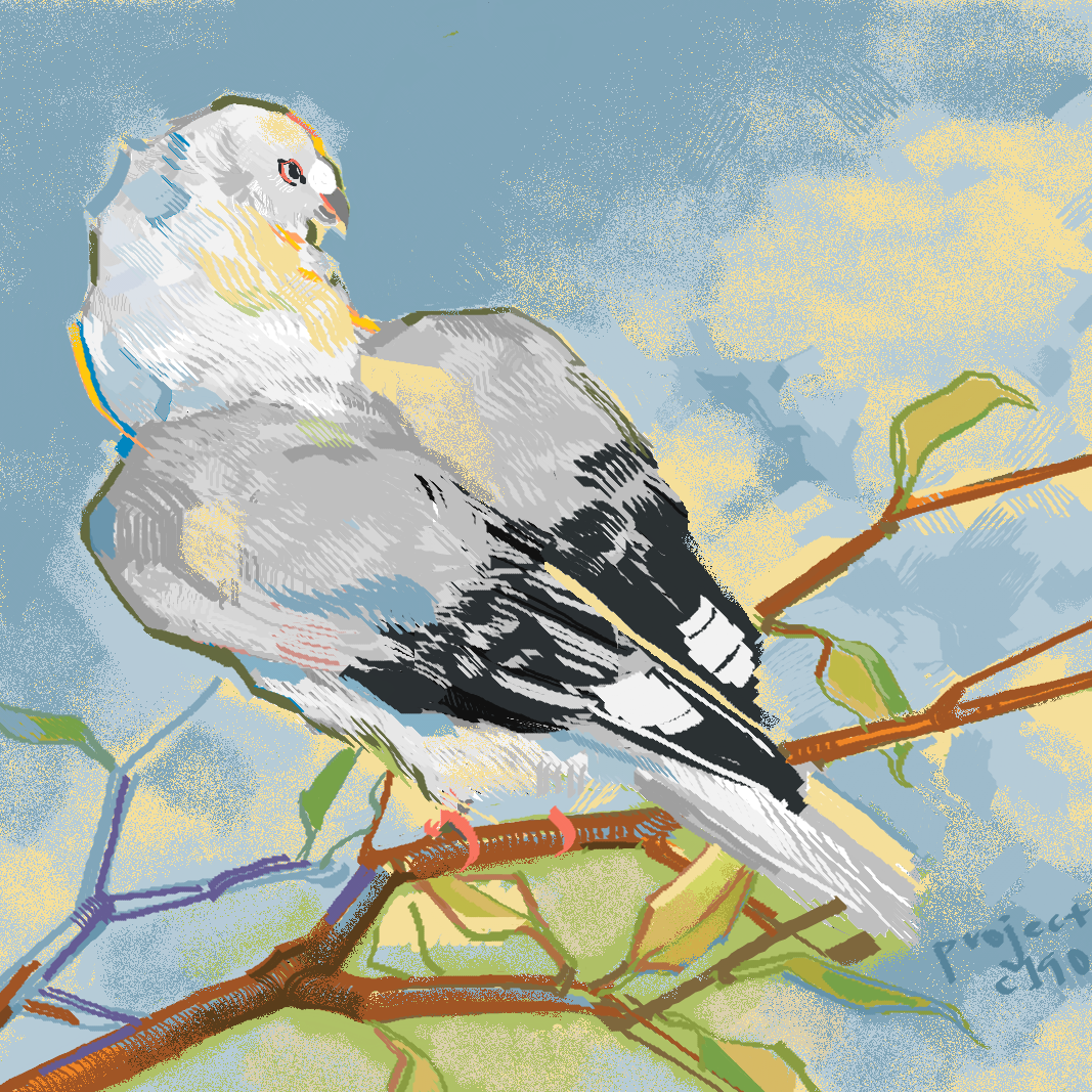
Was trying to salvage this drawing from December 2022. Here’s what I got.
I might actually like it now. I think it looked kind of disjointed before because I’d started by drawing the wings of a secretary bird, and then tried to mold it into a pigeon. I was also upset with the boring colors and lack of background, so this is an improvement.
It’s fun stitching a bunch of references together instead of drawing directly off of one. I was also thinking that for next time, I should start a drawing with a non-white color background. It’d influence my color choices when drawing the subject, and would certainly be more interesting than a character on a blank background.
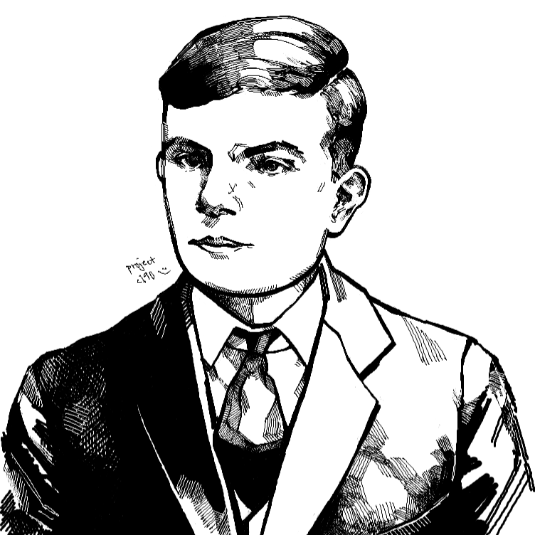
Here’s what I worked on today! It’s a portrait of Alan Turing. I really wanted to get his eyes right, so I’m pretty happy with what I have so far and wanted to share (Hint: Open the image in a new tab for better quality).
I tend to dislike artwork whose message is so direct that it’s practically propagandistic. This might seem overly critical, but it’s more of a reflection of my own taste rather than somebody else’s artistry: The other day, I saw a drawing of a TV with an outstretched hand protruding from its screen, and felt almost like it was a waste of the artists’ skill to draw something like that. At least for me, I want to create pieces that move people in such a way that it prompts them to think in multiple perspectives. I think the concepts that I’m playing with at the moment might be able to achieve that.
I don’t know if this even makes sense, but I guess what I’m getting at is all sides of an argument exist for a reason. Often, there is “objectively true” logic to every argument, but the premises on which the logic is built upon are why somebody would disagree with that argument. I don’t want to put out a piece that frames a situation so specifically it leaves no room for questioning and critical thought.
Lots more work to be done on this piece :’)
I’d like to finish in a few days, but we’ll see. Update 12/31/22: Ditched for the sake of new plans. Fingers crossed
I’m trying to train myself off of excessive perfectionism (in all sorts of things, really, but especially in drawing). I’ve also been wanting to develop some solid techniques for drawing birds. So, I started a new piece, and dove into coloring after no more than a few minutes of sketching. Ironically, I get a lot more out of drawing by forcing myself to “do” more than “think.” I guess it’s because if otherwise, I let thinking get in the way of doing. Here are my takeaways from today’s work:
Think of each feather as a brush stroke which can later be accentuated with pencils. Also, keep your pencils sharper.
The points at which two different layers of feathers meet should be clearly defined so that the wings look cleaner.
Dark and light areas should be carefully planned so that the bird does not simply look like a mess of detail.
I want to proceed by continuing to draw “mindlessly” like I have today, and afterwards consider what I can adjust about my process for next time.
Since realizing I should run with what I draw best instead of trying to fit a genre, I’ve been inspired to draw again. Also, I’ve got several distinct styles that I think might mesh together quite well. Maybe I’ll give it a shot in future sketches and pieces?
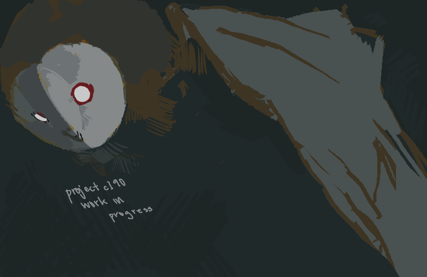
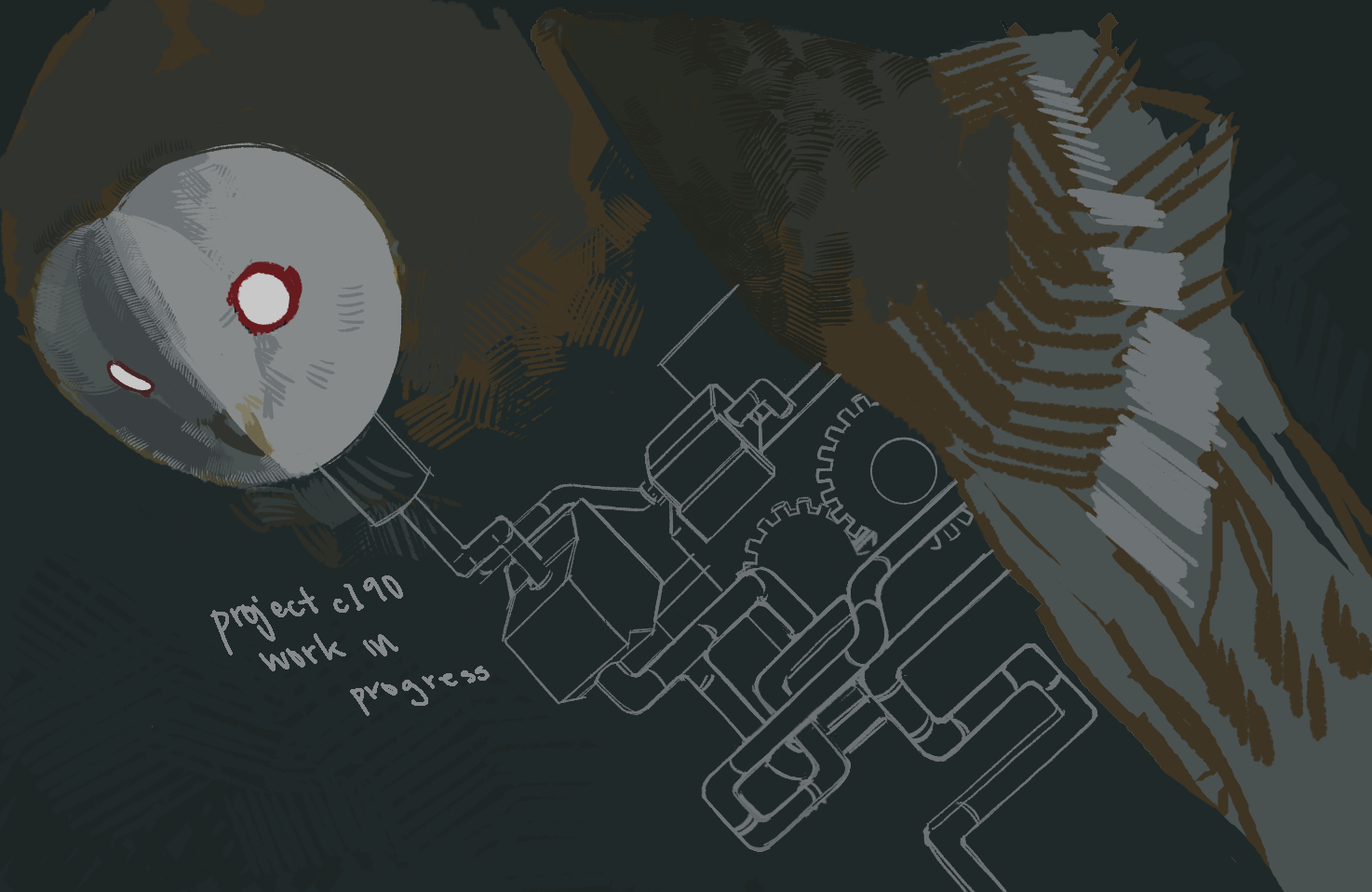
I call this “The Inventor’s Familiar.” I have more to say about this but I can’t seem to gather my thoughts right now :’) Later then

 Blog
Blog